Tuesday, April 10, 2007
Saturday, April 7, 2007
RPI and the Modern Architecture Dilemma, Appendix
Ryan Andress, Chemical Engineering '07
An Undergraduate’s Nightmare


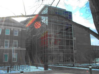
Doable during the day, however the device below will keep you out at night if you are not a graduate student who is authorized to be there, even if you HAVE to go inside
 Once inside, your first instinct is to go up the following stair case
(aka: staircase to NOWHERE)
Also notice all of the empty space

At the top of the staircase is a useless lounge, which can be reached by elevator anyway, the midway point is the following:

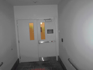
The Red Dot means you can’t go anywhere (Locked Door)
Going up the staircase wasn’t a good idea after all, unless of course you have access…
RPI and the Modern Architecture Dilemma, Part Three
Ryan Andress, Chemical Engineering '07
The Modern Architecture Dilemma on Rensselaer’s campus poses a threat to the technological world and culture of the future. Students are used to new structures that go up that are unattractive, lack function, Figure 1, or are structurally unsound, Figure 2. The students on campus lack culture, as noted by Guy Debord, and do not know what good art or architecture is. They have never heard of artists such as Albert Bierstadt or even more recent artists like Thomas Hart Benton and Reginald Marsh. They do not know what quality is, and how should they when they are exposed to today’s world, Figure 3, of mediocre art, functionless and unattractive architecture, and pure ignorance.
RPI and the Modern Archiecture Dilemma, Part Two
Ryan Andress, Chemical Engineering '07
The biotechnology center is an excellent example of modern architecture. This modern architecture, while better than most because of the attempt to match the façade to that of the original campus, showing that the architect at least has some taste, lacks function and is by no means authentic. The architecture presents a barrier between the occupant and clearly viewable areas, making it that much more frustrating when you cannot reach a destination within the building. The photos in Appendix A, demonstrate the difficulties of navigating the biotech center without security clearance. This, architecture that neither belongs, nor fits in the chosen site, is the Modern Architecture Dilemma.
Modern architecture tries to be creative by making the building inaccessible and stand out, usually by begin hideously ugly by any true quality art standard. The architect may not have this in mind when designing their piece, but the end product, particularly when it will be used on a daily basis, such as the biotech center, becomes hindering to the purpose it was designed for. The biotech center was built to be aesthetically pleasing, to the mass living in the “Spectacle” described by Debord, but nobody told the architect that three quarters of the doors would be locked to the majority of the RPI community. The nature of the architecture prevents full use of the building. With this is mind I wanted to discover if there was anything to be gained from the openness created by the biotech center’s style of architecture.
When using the biotechnology center, I am usually in a hurry to get to the fourth floor and then become immersed in my work. This time, however, I went to the building with the soul purpose of observation. I went up to the fourth floor, as I always do, but this time to setup a group of chairs for viewing. I posted a sign, Figure 4, to let people know it was a “public viewing area” and that they were welcome to join me.
I sat there for thirty minutes observing the people passing by, Figure 5, and looking at the view of the observatory. I realized that the openness of the biotech center allowed one to see nearly everything around them, including people inside and outside the building. I then proceeded to a different area, leaving the sign up, to see if anyone else would enjoy the view.

 Figure 5. Me sitting on the fourth floor of the biotechnology center, next to the sign shown in Figure 4
Within 5 minutes of me leaving, one person did proceed to sit in the “public viewing area.” They sat there for 2 minutes, looking around to see what I was looking at for the past half hour, and then got up and left. They later approached me and asked what I had been looking at. During the next 28 minutes, of me observing the observation area, a security guard approached me and questioned me about the sign, which he ripped down, and my purpose of being there. As if this was not enough, on my way out of the biotech center I was approached by a graduate student who told me “the security camera was watching you the whole time,” as if I was committing a crime by exhibiting the intended “artistic” architecture.
The next day one of the graduate students was upset with me, for going to the biotech center and not doing any work for an entire hour. They thought of me as less of a student because of my activities. From the reactions of professors, graduate students, and staff, it is obvious to me that the biotechnology is there for the sole purpose of research. It was not erected for leisure and yet the architect had leisure in mind when designing the building. This is the Modern Architecture Dilemma, the biotechnology is an attractive place for leisure activities, with the atrium and nice façade, but those activities are prohibited within the structure. The atrium then becomes a distraction and barrier to the necessary work of the students who use the biotechnology center. The architecture is no longer functional and therefore fails to be good architecture, as it does not satisfy the purpose criterion.
RPI and the Modern Architecture Dilemma, Part One
Rensselaer Polytechnic Institute and the Modern Architecture Dilemma
Part One: The Failure of Art and Architecture
Art ended in 1976, the year that Alexander Calder died. This date is conservative, as Guy Debord published a book 9 years earlier, The Society of the Spectacle, in which he declared “the beginning of the end of art.” Jackson Pollock was already dead for twenty years before this date, Andy Warhol stopped producing good works in the 1960s and Frank Stella, although still alive, has fallen to the ignorant masses in his style of art. If art is dead, architecture, being a form of art, is most likely dead also. This paper will suggest there is no proof otherwise.
Several criteria apply to art, these criteria are indescribable and may seem vague to the standard observer, but come natural to the true master artist. The art must be of a certain quality, have power, and poses authenticity. Modern art and architecture, when they originated fit these criteria, well some did, but they have lost their authenticity. We have seen everything, so your art must posses quality and be of a true, but not forced, artistic nature. Most modern architecture is neither authentic nor artistic. Even if today’s modern architecture did fit the proposed criteria, for it to be good architecture, it must also posses one more additional criterion not needed for other forms of art.
The criteria for good architecture include that needed for art, such as creativity or authenticity, power, and quality, but also the additional factor of purpose. Purpose should be indicative of the piece, except for the molding and other ornate areas. I began my project on public art with these criteria in mind. Figure 1 and Figure 2 display architecture on our campus, RPI, which has gone terribly wrong. Figure 1 is an interior view of the biotechnology center, although it looks attractive it does not satisfy the criteria of purpose. The building is supposed to serve a purpose however the atrium and modern architecture of the building violate this purpose. There is a lot of wasted space which is inherent to the architecture used. It is very difficult to navigate, please see the Appendix, and is therefore bad architecture. The biotech center will be discussed in further detail later in part two of the paper. The structure shown in Figure 2 fails at being architecture for obvious reasons.
 Figure 1. Useless
Biotech Center, RPI: example of architecture that does not truly fulfill its purpose
By establishing a clearly defined atrium space the Architect has failed to incorporate all of the space for functional purposes and has created an erratic layout making it near impossible to reach your desired destination.

Figure 2. Failure
A fountain on the RPI campus, which broke; a testament to the lack of quality and skill of execution
This demonstrates the lack of skill associated with Modern Architecture,The landscape architect who designed this piece (and claims full responsibility) has little to no technical knowledge, and chose not to use mortar, which resulted in a fatal flaw
As can be seen form the above figures, modern architecture lacks key criterion needed to be considered true art or even architecture. This can even be seen on RPI’s campus, as the only buildings with good form were made in the earlier half of the twentieth century. The newer buildings are unappealing, lack purpose, or are just unoriginal. Figure 3 best represents the failure of today’s architect, as I think the media and today’s culture, or lack of culture as suggested by Guy Debord, is the root of this epidemic in the art world.
 Figure 3.The Cause
An interior of a typical college dorm area at RPI, the reason why today’s art is so bad
A Modern society, who’s stupidity, lack of taste and culture, and need for mindless entertainment increases with each passing moment,This Modern “culture” has spelt the demise of quality Art and Architecture


